What children can teach governments about making graphs
What children can teach governments about making graphs
Authors: Craig Anderson, Lecturer in Statistics, University of Glasgow; Emily Granger, Research Fellow in Medical Statistics, London School of Hygiene & Tropical Medicine; Lucy Teece, Research Fellow in Medical Statistics, University of Leicester, and Maria Dunbar, PhD candidate in Statistics, University of Zürich

Thanks to the COVID-19 pandemic, the year 2020 has been dominated by data. But with great amounts of data comes great responsibility to communicate it properly. Unfortunately, the accurate and clear communication of complex information has been an area where many have fallen short this year. The UK government in particular has been criticised for the graphs used in its coronavirus briefings.
How can we do better? Adults could learn a thing or two from children about how to make graphs that people can easily read and understand.
As part of Maths Week England, we challenged primary school children to create graphs about the things that were important to them. We received more than 75 entries of amazing charts relating to sport, sweets, toys, pets and almost everything in between.
Many of the graphs were so beautiful, colourful, and informative that we thought they could be used to teach media organisations and government bodies a few lessons about displaying data.
Here we present some of the children’s excellent examples to provide a list of dos and don’ts when it come to graph making.
Do: label your axes and provide a scale
The main purpose of a graph is to provide a clear, concise and accurate representation of your data. An important, but often overlooked, part of this is making sure that your graph actually tells your reader what they are looking at. Producing a graph without proper labels is a bit like building a car without an engine – it might look good, but it’s not going to get you anywhere.
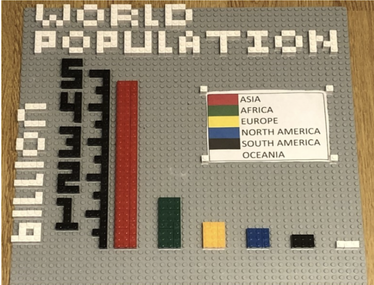
Nine-year-old TaoHai used Lego to produce an excellent representation of the population of each of the world’s continents. The y-axis (vertical axis) is very easy to understand – each large check mark on this axis represents one billion people.
In contrast, the graph in this story by the Press Association uses a line graph to display the number of global COVID-19 cases and deaths in which neither axis has a labelled scale, This makes it impossible to interpret the lines. Another issue with this plot is that it tries to put both cases and deaths on the same numerical scale, despite them being an order of magnitude apart.
Don’t: hide the origin
If you’re using a bar chart to compare a set of values which are quite close together, it can be tempting to start the numerical scale at a number other than zero in order to highlight their differences more clearly. However, this can often be misleading – making the numbers seem smaller than they actually are.
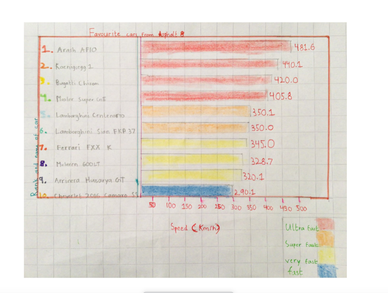
Farhan, aged eight, compared the speed of their favourite cars from the computer game “Asphalt 8”. The lowest speed is 290.1km/h, but they nonetheless opted to draw each of the bars from zero – ensuring that the relative differences in size can be compared fairly.
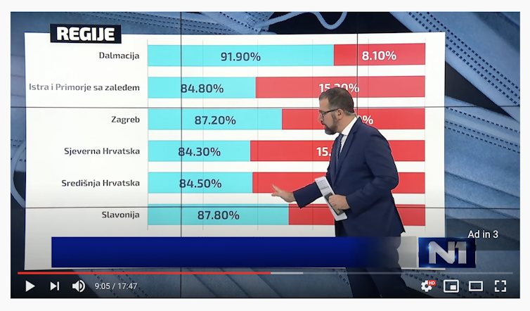
This is something several graphs relating to the pandemic has failed to do. For example, the graph in this video from Balkan TV station N1 shows the proportions of mask-wearing in different regions of Croatia (mask wearers in blue).
At first glance, you might think that more than half of the people in each region do not wear masks, but when you look more closely at the actual figures provided, you realise that the scale on the x-axis has started at 75% rather than 0%.
This case is likely just a misguided attempt to differentiate between the regions, but many unscrupulous graph makers use this technique in order to deliberately mislead.
Do: keep it simple
The whole point of providing people with a graph is that it’s easier to digest than lots of big tables of numbers. A well-designed graph will allow the reader to glance at it and immediately understand the key take-home point. If your graph is too cluttered or provides too much information, then it’s going to confuse the reader.
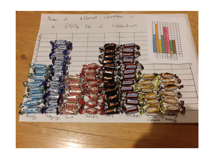
Our school children did a good job of following this important rule. Most of the entries focused on presenting the count of a single variable, which left the reader in no doubt as to the main findings of their investigation. Holly, aged 10, raided the treat cupboard to count the frequency of each type of chocolate in a standard box of Celebrations. You can immediately tell that there are more Milky Ways than anything else.
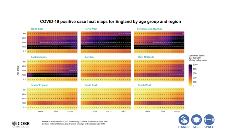
Compare this to the slide below from the English Chief Medical Officer’s press conference on October 31. There is an overload of information here – we’re being asked to compare positive test rates in nine different regions of England across five different age groups over 24 days.
This plot also breaches another golden rule of presenting data by having a series of numbers on the graph which are too small to read.
Don’t try to reinvent the wheel…
When statistics is taught at school, we tend to focus on tried and tested data visualisation techniques such as bar graphs, line graphs and pie charts. These classical methods are popular and have stood the test of time for a reason – they’re clear, simple to produce and easy to understand. Of course, there is always room for innovation.
Professional statisticians tend not to recommend pie charts much in general because they can tend to lead to less exact interpretations compared to a bar chart. But we will make an exception for nine year-old Elise, who took the concept of a pie chart literally to display their friends’ and family’s favourite types of jam.
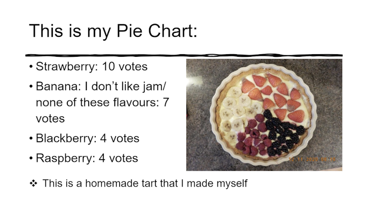
The main reason the pie chart worked is that it was still straightforward to understand the information being conveyed. That isn’t always the case though, as we can see from this BBC visualisation, which tries to use an animated flower to count COVID-19 deaths.
…but rules exist to be broken
Ultimately, however, each individual graph is judged on its own merits, and sometimes you can break some of the rules and still produce something fantastic.
Our competition winner was 10-year-old Lola, who constructed a wonderful 3D infographic displaying her daily exercise over a five-day period.
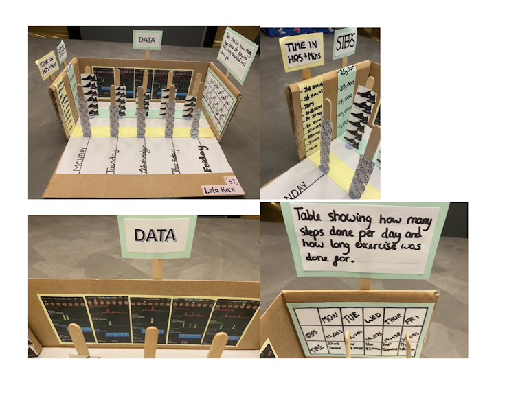
The beauty of this entry is that it is both simple and complex simultaneously – the lollipop sticks provide a straightforward representation of steps and exercise time, but for those who want to dig deeper, the actual data is also included elsewhere.
Acknowledegements: We would like to provide a massive thank you to all the children who participated.![]()
This article is republished from The Conversation under a Creative Commons license. Original article.