The complexity of drawing good proportional symbol maps
The complexity of drawing good proportional symbol maps
Proportional symbol maps (also known as graduated symbol maps) are used in Cartography to visualize quantitative data associated with specific locations. For a given point on a geographic map, a symbol (usually a disk or a square) is scaled such that its area is proportional to the numerical value associated to the point. This scaled symbol is then placed at that point.
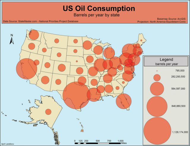
For an example, the following map shows the number of oil barrels consumed per year at the different states in the USA.

Cabello et al. 1 study this type of maps, discussing the advantages and disadvantages of the different types and then considering the problem of optimizing the quality of good drawings.
To begin with, they distinguish between conceptual point data, which are aggregated over an area but displayed at a representative location, and true point data, which are actually measured at a point. The latter is the case considered by Cabello et al.
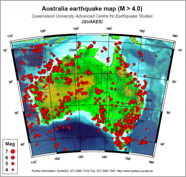
The previous figure showed an example of conceptual point data, measured over a state. The following figure shows an example of true point data, representing the epicenters and magnitudes of earthquakes in Australia (only earthquakes of magnitude greater than 4 are depicted).

Both the actual size and the ratio between symbol sizes are crucial in order to communicate the message. Therefore, a huge effort has been made aiming for the most effective communication, including both theoretical works and user studies2. It is commonly agreed that a map should not appear “too full” nor “too empty”, so that a “good” map should contain at least some overlapping symbols3.
However, it is not clear how much these symbols should overlap: On one hand, small symbols lead to small overlap, but make spatial patterns difficult to detect. On the other hand, large symbols lead to large overlap, but make difficult to identify and judge individual symbols. Hence, determining the ideal size for the symbols is a major issue when drawing this type of maps.
Another issue arises when choosing the type of the symbols. The most frequent are either circles (transparent) or disks (opaque). The former allow to see through overlaps, being able to judge their sizes more accurately. The latter turn out to be preferred by users because they contrast better with the underlaying map 4, although there is a strong correlation between the amount of overlap of opaque symbols and the error when judging their respective sizes 5.
The aim of Cabello et al. is to address the following algorithmic question: Given a set of opaque disks, whose centers have to be placed at given locations, how to arrange the disks so that all of them can be seen as well as possible?
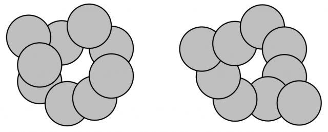
After setting some technical prerequisites, the authors consider two types of drawings. Physically realizable drawings are those in which the disks are stacked upon each other in an order such that (1) this order is uniquely determined at every face of the arrangement and (2) the orders associated with any two faces do not conflict. In particular, there is a unique ordering for any subset of at least two disks having a common intersection. The orders of the disks for all faces immediately imply which boundary arcs are indeed seen. See the following figure (right).

The left configuration in this figure is a stacking drawing, a natural restriction of physically realizable drawings in which there exists a total order on the disks, called stacking order. These are the drawings most frequently found on proportional symbol maps. (Note that the right drawing in the figure is a physically realizable drawing, but not a stacking drawing.)
A good drawing should show at least some part of all disks, since the accuracy with which the size of a disk can be judged is proportional to the portion of its boundary that is visible.
Thus, Cabello et al. consider the following optimization problems for the above types of drawings and a given set of opaque disks ![]() :
:
Max-Min problem: Find a physically realizable or a stacking drawing that maximizes the minimum visible boundary length of each disk. That is, ![]() .
.
Max-Total problem: Find a physically realizable or a stacking drawing that maximizes the total visible boundary length over all disks.
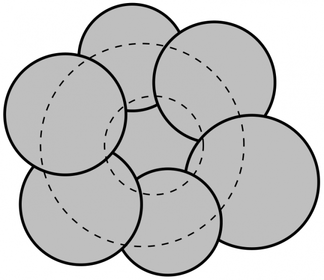
It is interesting to observe why visible boundary length is chosen, instead of the visible area. Situations like the one in the following figure might arise, where it is impossible to judge the area of a disk whose boundary is totally covered by other disks.

As main results, Cabello et al. show that both problems are NP-hard for physically realizable drawings. For stacking drawings the Max-Total problem remains open, while they show that the Max-Min problem can be solved in ![]() . This can be lowered to
. This can be lowered to ![]() if no point in the plane is covered by more than
if no point in the plane is covered by more than ![]() disks.
disks.
Furthermore, although the problems above are stated for disks, the authors show that their results can also be extended to squares or other shapes. Actually, if the symbols are unit-size squares, then the Max-Min problem for stacking drawings can be solved in ![]() time, regardless of how many squares overlap in a point.
time, regardless of how many squares overlap in a point.
After the paper by Cabello et al., several techniques have been proposed in order to reduce the computation times. Among them, let me mention the very recent paper by Cano et al.6, in which a novel integer linear programming formulation is proposed.
References
- Sergio Cabello, Herman Haverkort, Marc van Kreveld, and Bettina Speckmann. Algorithmic Aspects of Proportional Symbol Maps. Algorithmica (2010) 58: 543–565. http://dx.doi.org/10.1007/s00453-009-9281-8. ↩
- Border D. Dent, Jeffrey S. Torguson, and Thomas W. Hodler. Cartography: Thematic Map Design, 6th edition. McGraw-Hill, New York (2009). http://highered.mcgraw-hill.com/sites/0072943823/ ↩
- Terry A. Slocum, Robert B. McMaster, Fritz C. Kessler, and Hugh H. Howard. Thematic Cartography and Geovisualization, 3rd edition. Pearson (2009). http://www.pearsonhighered.com/slocum3e/ ↩
- Trevor Griffin. The importance of visual contrast for graduated circles. Cartography 19(1), 21–30 (1990). http://dx.doi.org/10.1080/00690805.1990.10438484 ↩
- Richard E. Groop, Daniel Cole. Overlapping graduated circles: Magnitude estimation and method of portrayal. Cartographica 15(2), 114–122 (1978). http://dx.doi.org/10.3138/Q5Q5-N244-8462-NG25 ↩
- Rafael G. Cano, Cid C. de Souza, Pedro J. de Rezende, Tallys Yunes. Arc-based integer programming formulations for three variants of proportional symbol maps. Electronic Notes in Discrete Mathematics 44, 251-256 (2013). http://dx.doi.org/10.1016/j.endm.2013.10.039 ↩
1 comment
[…] loves data representation, right? Mapping Ignorance blog has posted a lovely piece about proportional symbol maps (the ones where there’s a blob of appropriate size over a geographical region). On the bad […]